I had to leave our mini convention to come home and finish designing a third card for my Thursday night class and to cut all the card stock that we would need. It was an easy out, but I chose to use my convention card as one of my three cards (see previous post) for that night.
The second card I chose was a card we had done at a down line meeting back in April. It was a card that Susan (my up line) had chosen for us to do as a farewell to the Nature Walk stamp set (not knowing for sure if they were going to bring it back in the new catalog or not...but they did, yeah!!). It is a Z-card layout...

Second card for Thursday night stamp class
I hope it's not too hard to see, but the card stock colors are Rich Razzelberry, Old Olive and of course, Whisper White. Rich Razzelberry was used to stamp the butterfly...first on the front "Z" flap and then on the inner whisper white panel. The Rich Razzelberry and Old Olive pens were used to color in the branch image which was stamped and "stamped off" of the two panels. The sentiments used were from Bring on the Cake and Happiest Birthday Wishes. A little bit of Pear Pizzazz seam binding to finish it off and they were good to go!
The third card...that was the toughest...I'd just received the ribbon lace border punch, and I really wanted to use it! After searching several websites and blogs, I found one on Stamp with Amy's blog that I thought I might be able to work with (here's her card)...hers didn't use the border punch, it used ribbon, but pretty much everything else was the same, so yes, I CASE'd it (when you're pressed for time...sometimes, you've just got to go with it). Here is the front of the card...
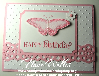
Thursday night stamp class - card#3 front panel
And here is what I came up with for the inside...

Thursday night stamp class - card#3 inner panel
It really turned out to be a beautiful card using Pretty in Pink and Whisper White. Ink colors used were Pretty in Pink and Rose Red. The stamp sets used were Curly Cute, Word Play, and Strength & Hope. That last set is from the Summer mini, and for each set purchased, Stampin' Up! is donating $2.00 to the Breast Cancer Research Fund...it doesn't matter if you purchase the wood mount, the clear mount or the digital version...their donation is the same. Anyway, back to the card...accessories used to make this card are, Big Shot, Polka Dot Embossing Folder, Sponge Dauber, Basic Pearls, Pretty in Pink Brads, Glue Dots, Two-Way Glue, 1/16" Circle Punch, Flower Punch from Punch Trio, Ticket Corner Punch, and the Lace Ribbon Border Punch.
When all was said and done, my students in the Thursday night class loved all of their cards, so it was all worth it!
No comments:
Post a Comment